Responsive tables, revisited
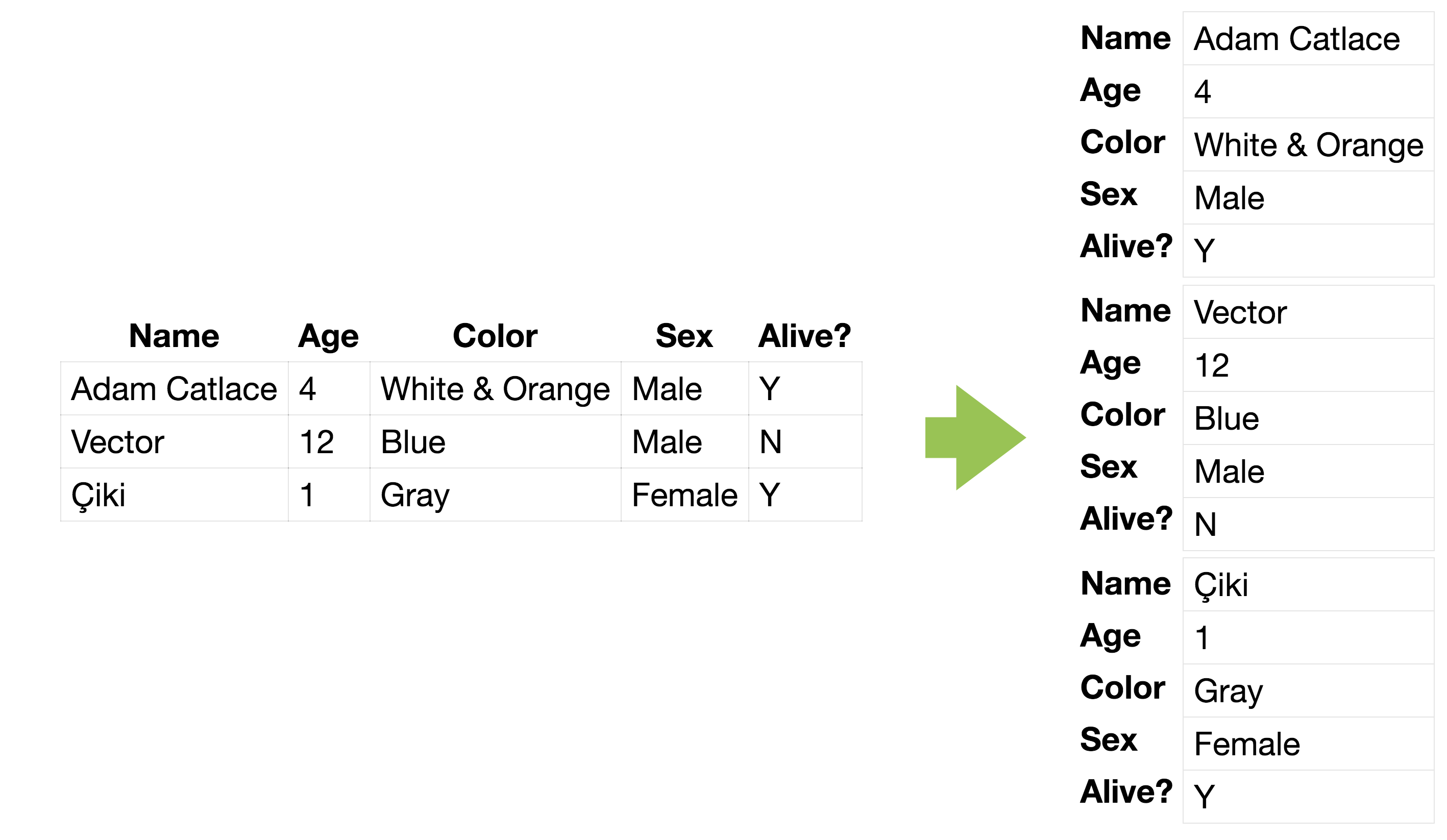
Many people have explored responsive tables. The usual idea is turning the table into key-value pairs so that cells become rows and there are only 2 columns total, which fit in any screen. However, this means table headers need to now be repeated for every row. The current ways to do that are:
- Duplicating content in CSS or via a data-* attribute, using generated content to insert it before every row.
- Using a definition list which naturally has duplicated
s, displaying it as a table in larger screens.
A few techniques that go in an entirely different direction are:
- Hiding non-essential columns in smaller screens
- Showing a thumbnail of the table instead, and display the full table on click
- Displaying a graph in smaller screens (e.g. a pie chart)
I think the key-value display is probably best because it works for any kind of table, and provides the same information. So I wondered, is there any way to create it without duplicating content either in the markup or in the CSS? After a bit of thinking, I came up with two ways, each with their own pros and cons.
Both techniques are very similar: They set table elements to display: block; so that they behave like normal elements and duplicate the Each method has its own pros and cons, but the following pros and cons apply to both: contents in two different ways:
Using text-shadow to copy text to other rows
. However, you can specify more shadows than needed, since overflow: hidden on the table prevents extra ones from showing up. Also, number of columns needs to be specified in the CSS (the --cols variable).
Using element() to copy the entire
to other rows
element() is currently only supported in Firefox :(