Every Layout
Create Every (or any?) Layout
Section titled “Create Every (or any?) Layout”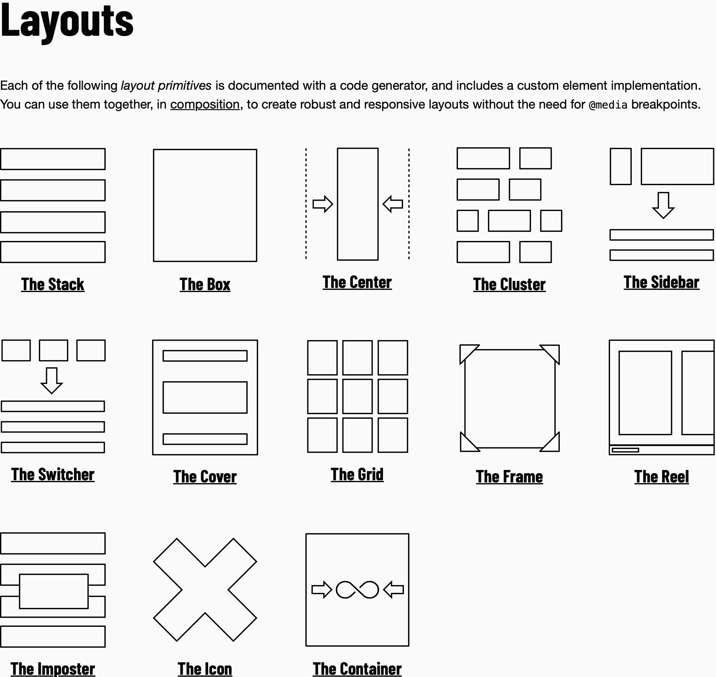
/** * Every Layout from Andy Bell and Heydon Pickering * https://every-layout.dev/ * * Please go to the website and purchase the latest version of their work. */
/* Stack */.stack {  --gap: 1rem;
  display: flex;  flex-direction: column;  justify-content: flex-start;  gap: var(--gap);}
/* Icon */.icon {  /**   * For older browsers use em units   * Cap unit is supported in most modern browsers   * 86% as of writing (2025-10-03)   * For more information on cap units see Can I Use:   * https://caniuse.com/mdn-css_types_length_cap   */
  /* width: 0.75em; */
  /* height: 0.75em; */  inline-size: 1cap;  block-size: 1cap;}
.with-icon {  display: inline-flex;  flex-wrap: wrap;  align-items: baseline;
  & .icon {    /* Space between the icon and the text */    margin-inline-end: 1rem;  }}
/* Cluster */.cluster {  --gap: 1rem;
  display: flex;  flex-wrap: wrap;  gap: var(--gap);  justify-content: flex-start;  align-items: center;}
/* Switcher */.switcher {  --gap: 1rem;  --threshold: 30rem;
  display: flex;  flex-wrap: wrap;  gap: var(--gap);
  & > * {    flex-grow: 1;    flex-basis: calc((var(--threshold) - 100%) * 999);  }
  /* Adjust the ":nth-child() number - 1" to allow the appropriate max number of  elements on a line */  :where(&) > :nth-last-child(n + 5) {    flex-basis: 100%;  }
  :where(&) > :nth-last-child(n + 5) ~ * {    flex-basis: 100%;  }}
/* Sidebar */.with-sidebar {  /* We assume the first child to be the sidebar and the content to be the last  child */  --gap: 1rem;
  display: flex;  flex-wrap: wrap;  gap: var(--gap);
  & > :first-child {    flex-grow: 1;  }
  & > :last-child {    flex-basis: 0;    flex-grow: 999;
    /* The content takes up at least half the width */    min-inline-size: 50%;  }}
/* Center */.center {  --max-size: 60ch;
  box-sizing: content-box;  margin-inline: auto;  max-inline-size: var(--max-size);  padding-inline: 1rem;}
/* Box */.box {  --color-light: hsl(0deg 0% 93%);  --color-dark: hsl(0deg 0% 13%);  --border-width: 2px;  --gap: 1rem;
  padding: var(--gap);  outline: var(--border-width) solid transparent;  outline-offset: calc(var(--border-width) * -1);  color: var(--color-dark);  background-color: var(--color-light);
  & * {    color: inherit;  }
  &.invert {    color: var(--color-light);    background-color: var(--color-dark);  }}
/* Grid */.grid {  --gap: 1rem;  --min-size: 30ch;
  display: grid;  gap: var(--gap);  grid-template-columns: repeat(    auto-fit,    [col-start] minmax(min(var(--min-size), 100%), 1fr) [col-end]  );}
/* Frame */.frame {  --numerator: 16;  --denominator: 9;
  aspect-ratio: var(--numerator) / var(--denominator);  overflow: hidden;  display: flex;  flex-wrap: wrap;  justify-content: center;  align-items: center;
  & > img,  & > video {    inline-size: 100%;    block-size: 100%;    object-fit: cover;  }}
/* Cover */.cover {  display: flex;  flex-direction: column;  min-block-size: 100dvh;  padding: 1rem;
  & > * {    margin-block: 1rem;  }
  /* Adjust the HTML tag (h1) / class selector to whatever is in the element that  should be towards the vertical center of the space  */  & > h1 {    margin-block: auto;  }
  & > :first-child:not(h1) {    margin-block-start: 0;  }
  & > :last-child:not(h1) {    margin-block-end: 0;  }}
/* Reel */.reel {  --color-light: hsl(0deg 0% 93%);  --color-dark: hsl(0deg 0% 13%);  --item-width: auto;  --gap: 1rem;  --height: auto;
  display: flex;  flex-wrap: wrap;  block-size: var(--height, auto);  overflow: auto hidden;  overscroll-behavior: contain;  background-repeat: no-repeat;  scrollbar-color: var(--color-light) var(--color-dark);
  &::-webkit-scrollbar {    block-size: 1rem;  }
  &::-webkit-scrollbar-track {    background-color: var(--color-dark);  }
  &::-webkit-scrollbar-thumb {    background-color: var(--color-dark);    background-image: linear-gradient(      var(--color-dark) 0,      var(--color-dark) 0.25rem,      var(--color-light) 0.25rem,      var(--color-light) 0.75rem,      var(--color-dark) 0.75rem    );    background-repeat: no-repeat;  }
  & > * {    flex: 0 0 var(--item-width, auto);  }
  & > img {    block-size: 100%;    flex-basis: auto;    inline-size: auto;  }
  & > * + * {    margin-inline-start: var(--gap);  }
  &.overflowing {    padding-block-end: var(--gap);  }}
/* Imposter */.imposter {  position: absolute;  inset-block-start: 50%;  inset-inline-start: 50%;  transform: translate(-50%, -50%);
  &.contain {    --margin: 1rem;
    overflow: auto;    overscroll-behavior: contain;    max-inline-size: calc(100% - (var(--margin) * 2));    max-block-size: calc(100% - (var(--margin) * 2));  }}
/* Container Query */.container {  container-name: container-name;  container-type: inline-size;}